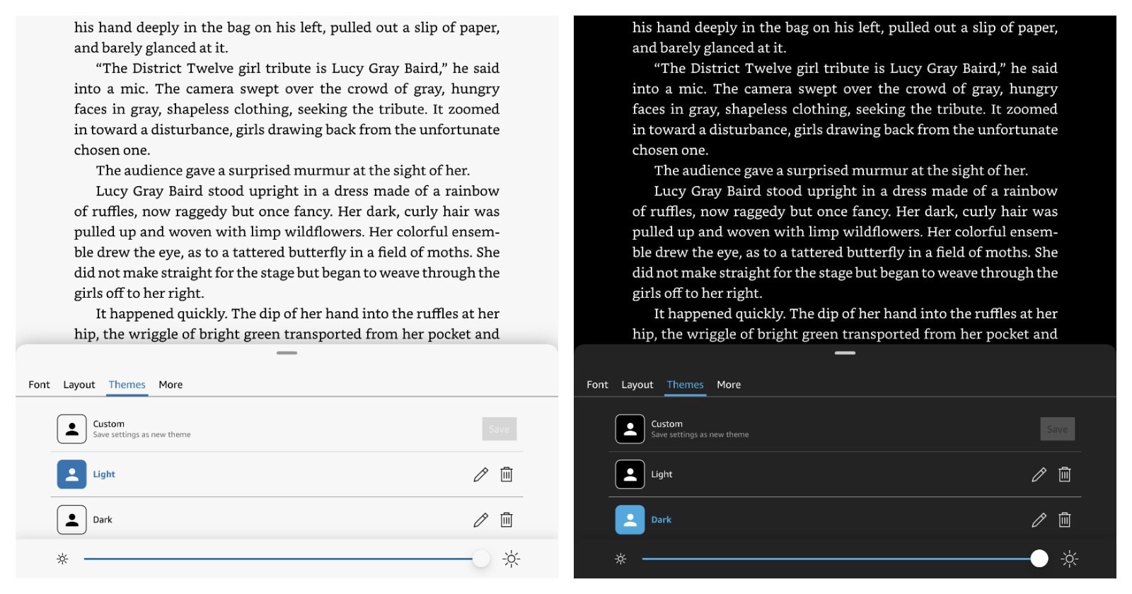
In a new update of the Kindle for iPadOS, you can save favorite settings of the reading interface – a great way to switch dark and light mode.
Since Apple introduced iPadOS in September 2019, many app creators, including Amazon, have split developments of their apps to make the most use of now separate iOS and iPadOS operating systems.
Kindle app for iPhone has been updated with custom themes a few months ago, but we had to wait for the iPadOS update until now.
This is an essential improvement, as it lets you fully customize the look of the reading interface. What’s even more important, you can now quickly access your custom theme right from the “Aa” menu.
I’ve been using custom themes on the Kindle iPhone app for some time to quickly switch the reading interface between dark and light mode. As you know, most book reading apps come with dark & light themes, but they are only applied to library view. If you wanted to change the reading interface (from white/sepia background to black/dark and backwards), you had to do it manually every time.
With the new feature, Kindle for iPadOS lets you save your custom setting – not only the background color, but also the font face, line height, spacing, and margins.
The greatest thing of all is that you can also save the brightness level in your custom setting!
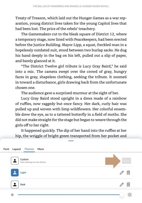
To save a custom theme in the Kindle for iPadOS:
1. Open the app and then tap to open any book.
2. Tap “Aa” icon in the top right corner.
3. In the tools panel that slides up from the bottom of the display, go to “Layout” section and select your favorite settings.
4. In the “Font” section, select your favorite font. You have 8 to chose from: Amazon Ember Bold, Baskerville, Bookerly, Caecilia, Georgia, Helvetica, OpenDyslexic, and Palatino.
5. Tap “Themes” section. At the bottom, you can slide the brightness bar to the preferred level. Once you are done, tap the “Save” button.
The updated version of Kindle for iPadOS comes with four default themes. Each one preserves your choice of font and background:
- Compact – a small font and line spacing.
- Standard – if you want to quickly go back to the app’s default reading settings.
- Large – the font size and line spacing are increased by approximately 25%.
- Low Vision – this theme comes with a fixed bold font (Amazon Ember Bold) and huge font size.
More tips and lists for iPad users:
[ef-archive number=5 tag=”ipad”]





Leave a Reply